Tribute page

Yesterday, I was working on Free Code Camp challenges when I reached the first project challenge of the course: build a dynamic tribute page using Bootstrap. I decided then that I wouldn’t start it until the next day. When a few hours later I read breaking news that Chester Bennington had committed suicide, I changed my mind immediately.
Chester was Linkin Park’s lead singer, and Linkin Park was my favorite band growing up. I remember in elementary school that my friends and I all loved Linkin Park. At the after-school daycare, oftentimes someone would just start rapping the first verse of “In the End” and we’d all join in. We’d rap the lyrics more and more loudly until we were yelling over each other, reaching the climax that was the chorus, half singing and half screaming as we imitated Chester’s ferocious vocals.
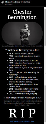
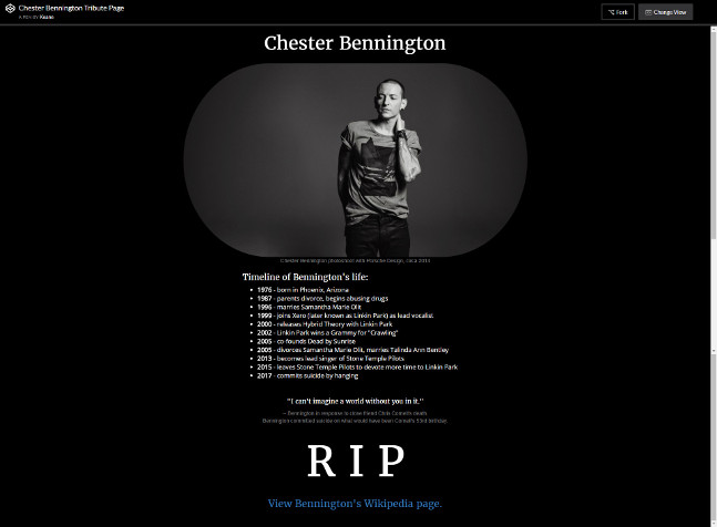
With those memories in mind, I started working on a basic tribute website for Chester. The requirements from Free Code Camp were simple: there must be an image, and there must be a link to more information about the person. I closely followed the example project that was provided, which had (from top to bottom) Dr. Norman Borlaug’s name, a large image featuring him, a timeline of his life, a quote about him, and a link to his Wikipedia page.
The task seemed very simple to me—little did I realize that my perfectionism would make this a very time-consuming ordeal. The first thing that I struggled with was making the picture of Chester that I’d chosen look nice. The sharp edges and corners made the picture look like it was just slapped on the page (because it was just slapped on the page). I tried to make the corners round, but my CSS was not doing what I wanted it to do; it was rounding the corners in a way that made the picture’s shape into an oval instead of maintaining the rectangular shape of the image. As I fiddled with the parameters, I accidentally made the picture pill-shaped. I realized that it gave the page a more professional look, so I kept it.
The next thing I had to deal with was making the timeline align properly near the center of the page. On a small phone screen, it was too far to the right. On my desktop screen, it was too far to the left. After a very long time and a lot of trial and error with the Bootstrap grid, I managed to get the timeline exactly where I wanted it.
The last challenge I faced was getting the image to be the right size on different display sizes. I was using “img-responsive” for the picture, which meant that the picture was automatically sized to fill the width of the screen. This meant that the picture was way too large on my desktop’s widescreen monitor. Put a container around the picture and made the container 80% size. Now, the picture’s width was always 80% of the screen’s width. This looked fine on desktop, but it made the picture too small on my phone.
What I wanted was for the picture to fill the entire width of my phone’s screen, but not fill nearly as much on my desktop’s screen. In the end, using the Bootstrap grid was the solution yet again. Bootstrap’s dynamic grid divides the width of the user’s screen into 12 equal-width columns. I had the image take up all 12 columns on extra small (phone) screens, 10 columns (with an offset of 1 to center the image) on small (tablet) screens, 8 columns (with an offset of 2) on medium (desktop) screens, and 6 columns (with an offset of 3) on large screens.
After hours of scrutinizing the page, finding flaws in it, and making corrections, I decided that enough was enough and considered it complete. Here’s the CodePen I made it in.
This is the website on my desktop screen:
And this is what the website would look like on a phone screen: